Bullish Candlestick Patterns - A Trader's Guide
Over time, patterns form on candlestick charts which provide insight into market sentiment. These candlestick patterns can be used by traders to help make predictions on future price movements. In particular, bullish candlestick patterns can be used to spot buying opportunities in the market.
In this article, we will examine bullish candlestick patterns in detail. We will highlight various examples of patterns which can indicate a reversal of price and explain how these patterns can be used to identify trading opportunities within the markets.
The information in this article is provided for educational purposes only and does not constitute financial advice. Consult a financial advisor before making investment decisions.
Table of Contents
Understanding Candlestick Patterns
Candlestick charts are a type of financial chart used to show the price movements of an asset. Each trading session is represented by a single “candle” on the chart, which is made up of the opening, closing, high and low prices of the session.
Each candlestick has a wide part, known as the body or the real-body, which is the range between the opening and closing price of the session. The high and low prices are depicted by upper and lower wicks, or shadows, which extend from the body of the candle. This results in something which looks like the below:
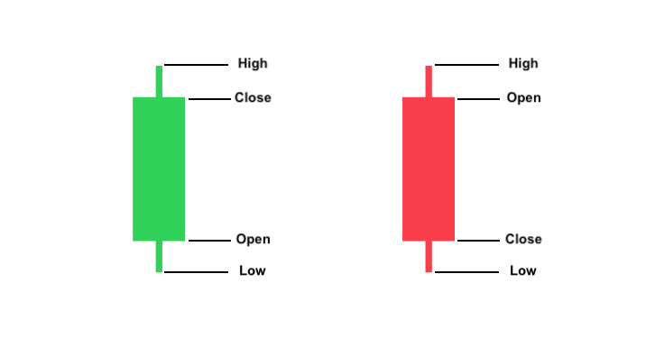
If a session’s closing price is higher than its opening price, the body of the resultant candle is traditionally coloured white or green. Conversely, if the closing price is lower than the opening price, the resultant candle is traditionally coloured black or red. However, these colours can be customised to each trader’s preference.
Consequently, from a simple glance, traders can glean a substantial amount of information from each candle and its respective trading session.
Types of Candlestick Patterns
At first glance, candlestick patterns may appear totally random. However, over time, familiar patterns will begin to emerge amongst the candles which can provide insight into the current market sentiment and indications as to where price may move next.
Bullish and Bearish Patterns
At its most simple, these patterns can be divided into bullish and bearish patterns.
Bullish patterns provide an indication that prices may be about to rise, whereas bearish patterns imply that prices may be about to fall. It is the former with which we will mostly be concerning ourselves in this article and which we will provide examples of in due course.
Interpretation of Price Action and Trends
We can think of each trading session like a battle between buyers and sellers. A green, bullish candle implies that buyers “won” the session, whereas a red, bearish candle, implies that it was sellers who were victorious.
By analysing candlestick patterns, traders can gauge the current market sentiment and identify when it may be about to change, allowing them to make predictions about where price may be heading next.
For example, a bullish candlestick pattern which appears at the bottom of a downtrend tells traders that buyers may be about to seize control of the market from sellers. This would result in demand outstripping supply and prices increasing.
This may result in the start of a new trend or a temporary reversal in price before the downward trend resumes course. Of course, it could also simply be a false signal, which is why it is important for traders to confirm any signals they receive from candlestick patterns. More on that later.
Timeframes: Daily, Weekly, and Monthly Analysis
Candlestick patterns can appear on the price chart of any asset, in any market and on any timeframe. That means that you will be able to identify bullish candlestick patterns on 1-minute charts, monthly charts and everything in between.
Whilst candlestick patterns are likely to appear more frequently on shorter timeframes, it is generally accepted that the longer the timeframe, the more reliable the signal that the patterns produce.
This is because longer timeframes tend to filter out a lot of the short-term price corrections and volatility (often referred to as “noise”) which appear on shorter timeframes. This tends to result in more reliable signals being formed.
However, this doesn’t necessarily mean that traders shouldn’t trade candlestick patterns on shorter timeframes. The most appropriate timeframe for trading these patterns will depend largely on your individual trading profile, your goals and your attitude to risk.
Trendlines
When trading candlestick patterns, it’s important for traders to look beyond candlestick patterns and look for confirmation of the signals they produce by using different technical analysis tools.
Trendlines: Support, Resistance and Breakouts
By analysing areas of support and resistance, traders can gain better insight into the reliability of the signals provided by bullish candlestick patterns.
An asset's price doesn't move up or down in a straight line. For example, in an uptrend, price often rises in a zig-zag motion: rising, before pulling back and then rising once again.
By connecting these points which price pulls back to, traders may be able to use trendlines to identify areas of support in an uptrend. By a similar process, traders can sometimes identify areas of resistance in a downtrend.
For example, in the weekly chart of FTSE 100 utility stock SSE, we can see that for almost three years the red trendline supports share price as it gradually works its way upwards.
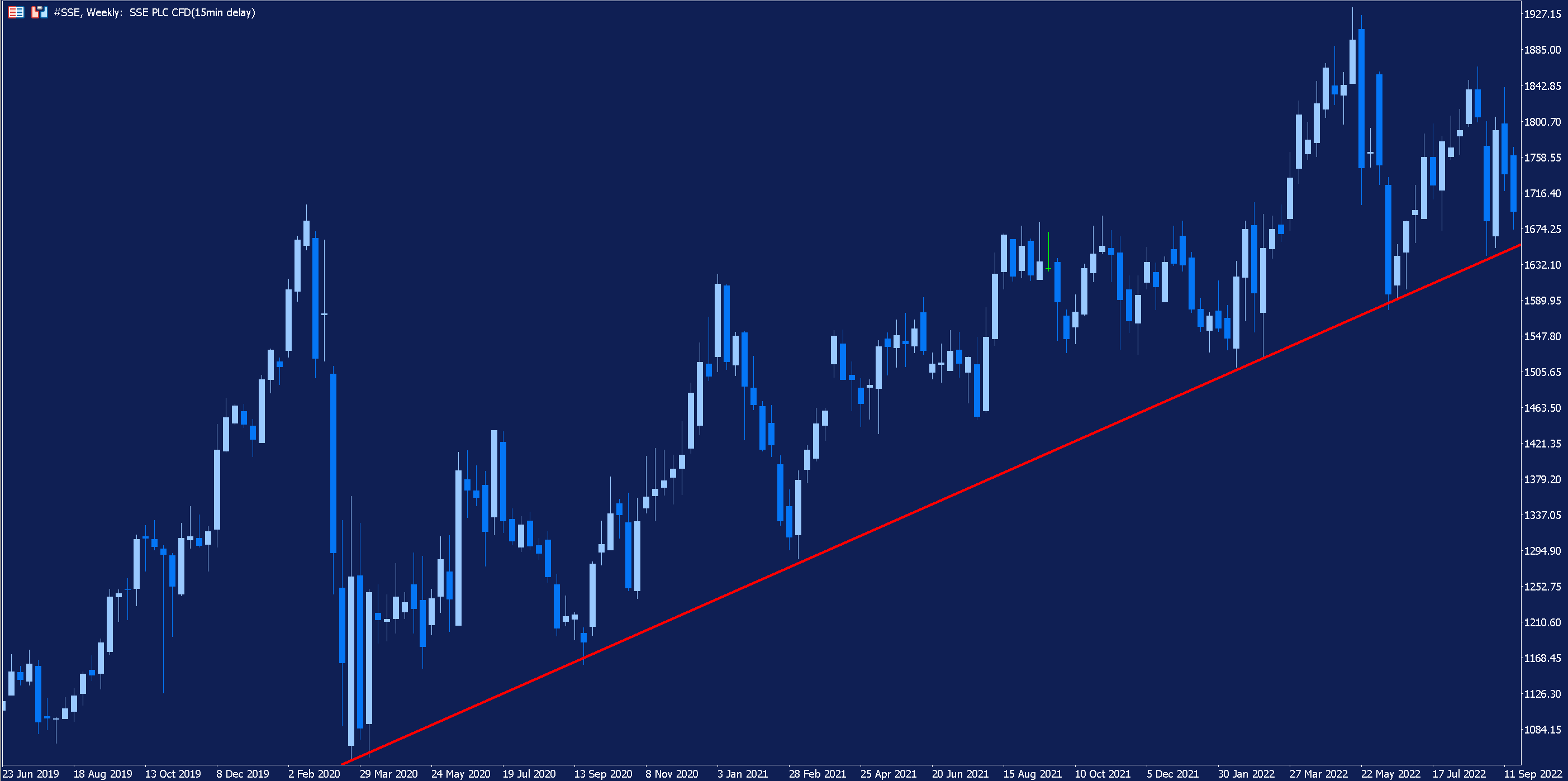
Bullish candlestick patterns may be more significant if they occur near historic areas of support during an uptrend. Similarly, if a bullish candlestick pattern forms during a downtrend and price action subsequently breaks through an area of historic resistance, this may act as confirmation of a bullish reversal in price.
Technical Indicators for Confirmation
As well as trendlines, there are a number of technical indicators which can be used by traders to help confirm signals generated by candlestick patterns.
Moving Averages: Long-Term and Short-Term Trends
The moving average indicator helps traders smooth out price data by calculating an average price over a predetermined lookback period which is constantly updating as price changes.
Moving averages can be used to help identify an existing trend, detect a change in trend direction and determine support and resistance levels. So, how can we use a moving average to complement candlestick patterns?
When price is above its moving average, it suggests that an uptrend is in progress. On the other hand, when price is below its moving average, it indicates a downtrend is in progress.
Below is the weekly chart of FTSE 100 tobacco company British American Tobacco with a 20-period moving average indicator added.
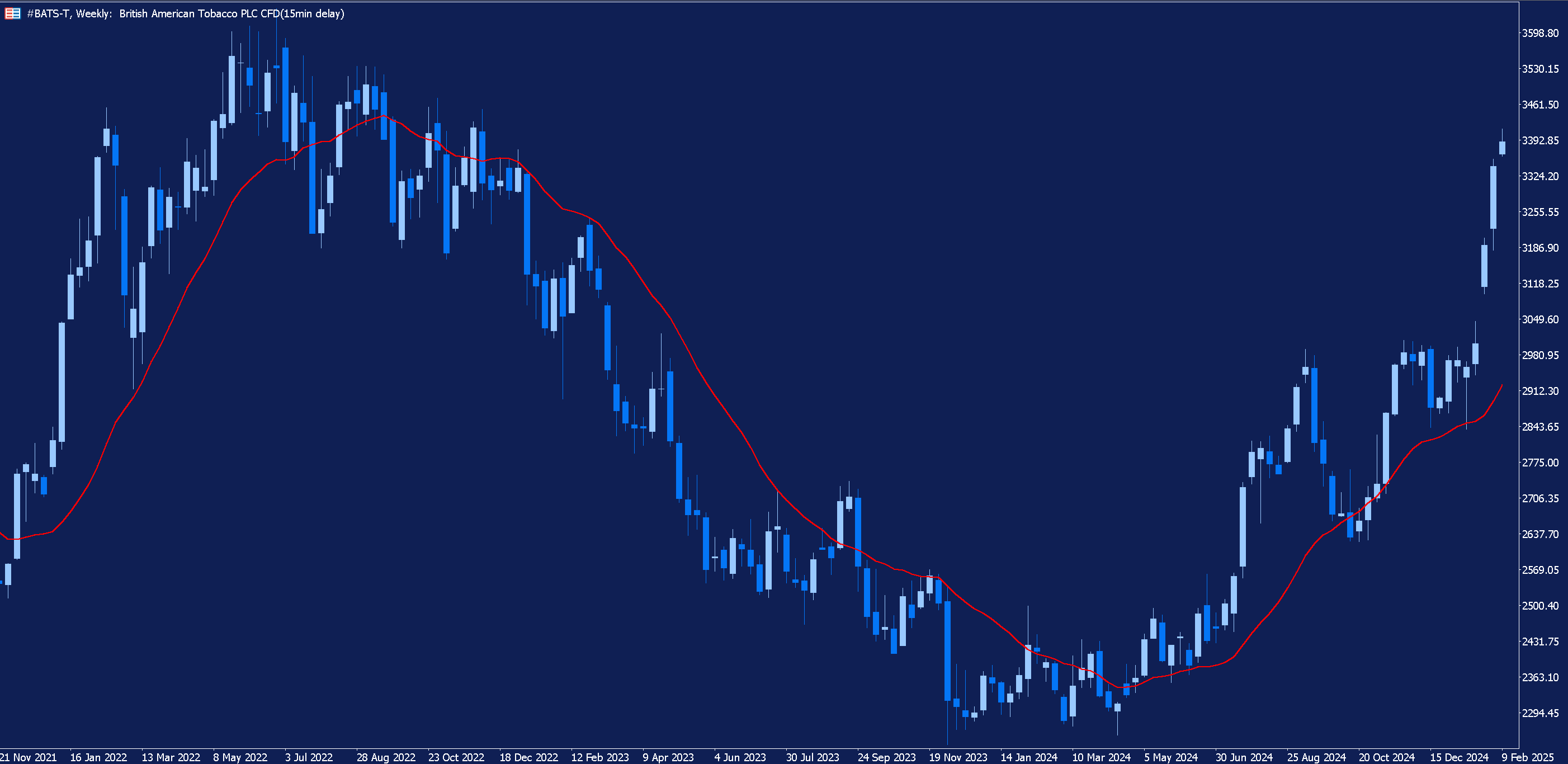
Sometimes, during a trend, a moving average can act as support or resistance. When the price is above its moving average, bullish candlestick patterns which form near the moving average may be considered more significant and can signal a continuation of the prevailing uptrend.
When price is below the moving average, a bullish candlestick pattern may indicate an imminent price reversal. In such an instance, traders may be alerted to the potential reversal by the pattern but wait until price has crossed above its moving average before taking a position in the market.
RSI, MACD, and Stochastic Oscillator: Additional Confirmation Tools
There are many other indicators which traders can use as additional confirmation of a potential bullish reversal, such as the Relative Strength Index (RSI), the Moving Average Convergence/Divergence Indicator (MACD) and the Stochastic Oscillator.
Whilst all these indicators display different things, all three can be used to spot divergences – discrepancies between an asset’s price and the indicator which can sometimes serve as a prelude to a reversal.
Furthermore, the RSI and Stochastic Oscillator can both be used to identify overbought and oversold conditions in an asset which, again, can serve as a signal of a potential price reversal.
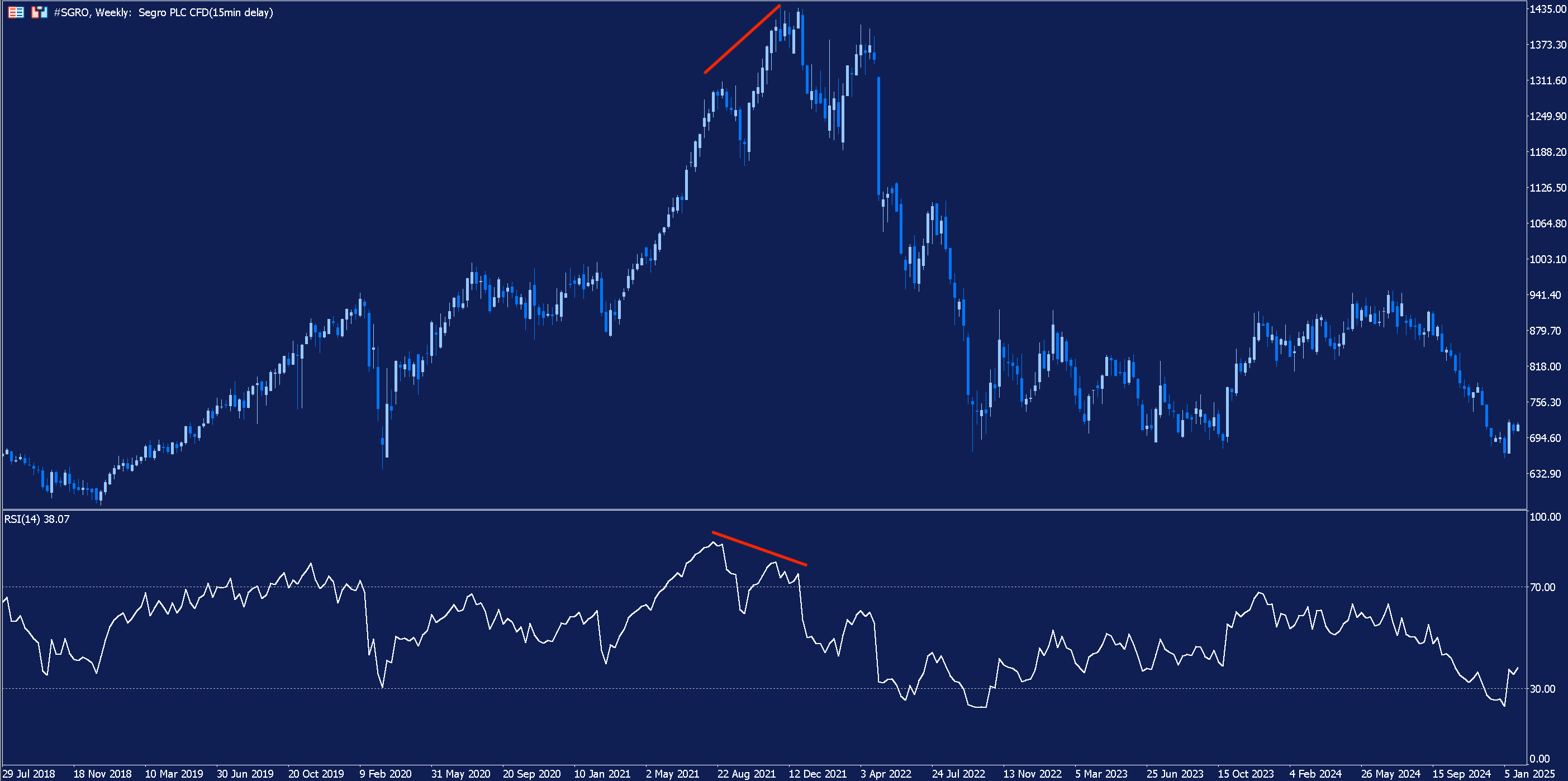
Above is the weekly chart of FTSE 100 Real Estate Investment Trust (REIT) Segro with an RSI added. We can see that, during an uptrend, the RSI begins moving lower whilst share price continues rising.
This is an example of divergence and, sure enough, shortly afterwards, share price follows the RSI’s lead and begins to descend.
Nevertheless, it is important to note that not every reversal will be preceded by divergence and that not every instance of divergence will result in a price reversal.
Trading Volume: Confirming Trends and Breakouts
As well as trendlines and technical indicators, traders can analyse trading volume to gauge the strength of the signals provided by bullish candlestick patterns.
Interpreting Trading Volume for Better Decision-Making
Generally, bullish candlestick patterns which are accompanied by an increase in trading volume are considered to be stronger signals of price reversals.
Enhance Your Trading Knowledge - Explore Our Free Resources.

Specific Bullish Candlestick Patterns
So, let’s now take a look at specific bullish candlestick patterns. For each pattern, we will explain how it can be identified and interpreted, and what it can mean for future price movements.
The Hammer
The hammer is a candlestick pattern consisting of a single candle which appears at the bottom of a downtrend and signals a potential bullish reversal. The candle has a short body, a long lower shadow and a small, or no, upper shadow. The body itself can be either bullish (green) or bearish (red).
The image below depicts what the hammer looks like to aid in its identification.
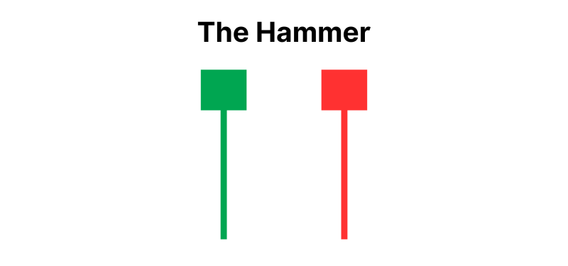
So, how can we interpret the hammer when it forms at the end of a downtrend? Its appearance after a period of sustained selling pressure implies that sellers in the market may have run out of steam and finally yielded to buying pressure.
The long lower shadow indicates that the sellers were initially successful in pushing price further down during the session. However, they are unable to hold price near the session low, and buyers successfully manage to force price back up near the open.
This may signal a change in sentiment and, consequently, could herald the beginning of a new uptrend.
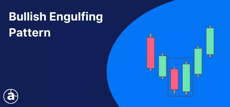
The Bullish Engulfing Pattern
The bullish engulfing pattern signals a potential bullish reversal and consists of two candlesticks: a bearish candle followed by a bullish candle.
There is a gap between the closing price of the first candle and the opening price of the second candle, but the second candle eventually closes at a higher level than the opening price of the first candle. The visual effect of this is that the body of the second, bullish, candle totally engulfs the body of the first, bearish, candle.
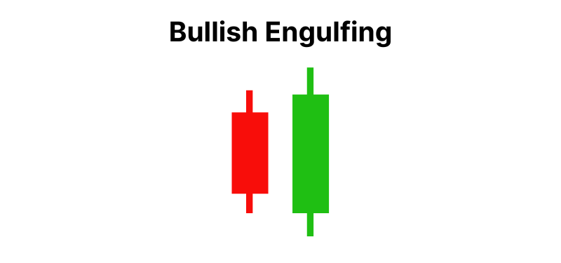
When the bullish engulfing pattern forms at the bottom of a downtrend, it signals that the downward movement may be subsiding, and buyers may be about to seize control of the market.
Despite the gap down between the candles, the bears (sellers) were not able to keep control of the session. Instead, the bulls (buyers) gained the upper hand and decisively pushed the price up. The session closes higher than the previous session’s open.
This marks a shift in sentiment between the gap lower at the start of the session and the strong buying pressure which followed and indicates that a reversal may be about to take place.
The Morning Star Pattern
Next up is the morning star pattern, which appears after a downtrend and signals a potential bullish reversal.
The pattern consists of three consecutive candles: a short-bodied candle which is sandwiched between a long bearish candle on the left and a long bullish candle on the right. The middle candle can either bullish or bearish.
The middle candle opens lower than the close of the first candle and forms the lowest point of the pattern. The third candle opens higher than the close of the middle candle and closes above the midpoint of the first candle’s body. Below is an example of what this might look like:
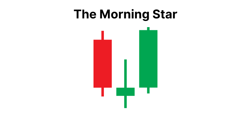
After strong selling pressure during the first session, the short middle candle highlights a period of indecision, where neither bulls nor bears dominate the market convincingly. Following this moment of hesitancy, the bulls take control, resulting in a long bullish candle.
This pattern indicts that the downtrend may be breaking down, as the bears give way to the bulls, and that an uptrend may be about to begin.
The Inverted Hammer Pattern
As the name suggests, visually, the inverted hammer pattern is essentially the hammer but upside down. The candle has a short body - which can be either bullish or bearish, a long upper shadow and a short, or no, lower shadow.
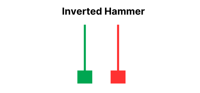
Following a downtrend, the formation of an inverted hammer indicates that sellers may be losing momentum, meaning a reversal could be imminent.
Although sellers were able to drive price back down towards its opening level, the long upper shadow demonstrates that there was significant buying pressure during the session. The next candlestick is crucial, but the inverted hammer indicates that a bullish reversal may be on the cards.
The Piercing Line Pattern
The last bullish candlestick pattern we’ll highlight is the piercing line pattern.
The piercing line consists of two candlesticks: a bearish candle followed by a bullish candle. The second candle opens lower than the previous candle’s close but rallies to close higher than its midpoint. The pattern appears after a downtrend and signals a potential bullish reversal.
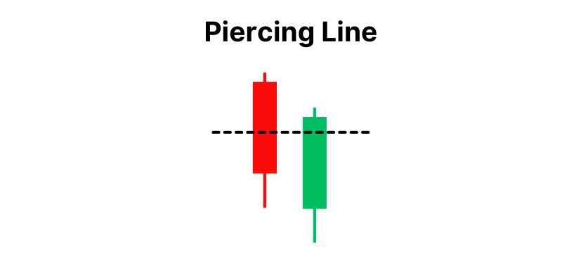
The logic is similar to that of the bullish engulfing pattern. The bears were undoubtedly in control of the first session. However, although they pushed the price down at the beginning of the session resulting in the second candle ”gapping down”, the bulls wrestled back control and turned things around.
Applying Candlestick Patterns: A Step-by-Step Guide
So, what should traders do when they identify these patterns on a price chart?
Some aggressive traders may choose to enter the market as soon as the final candle of the pattern closes. However, the more prudent approach when trading bullish candlestick patterns is to seek confirmation of a reversal before taking a position.
Besides waiting to see confirmation of a reversal in the subsequent sessions, reversal patterns can also be confirmed by using other technical analysis tools, such as trendlines or technical indicators.
Let’s look at a real-life example of this in action. Below is a weekly chart of FTSE 100 tech stock Sage Group; following a downward movement in price, a hammer candlestick appears.
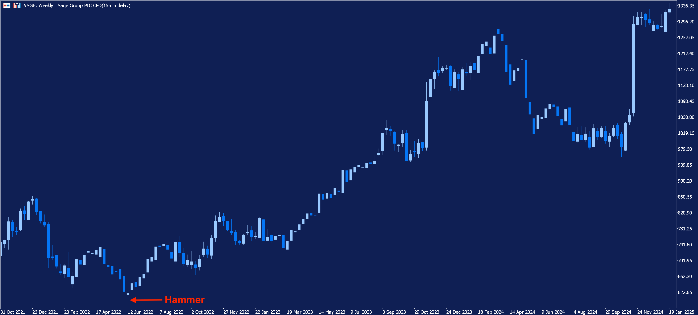
With the benefit of hindsight, we can see that, following the highlighted hammer, Sage’s price entered a long-term uptrend. However, a trader trading this pattern in real-time would have wanted additional confirmation prior to entering the market.
Below we have zoomed in on the relevant section of the chart and added the Stochastic Oscillator.
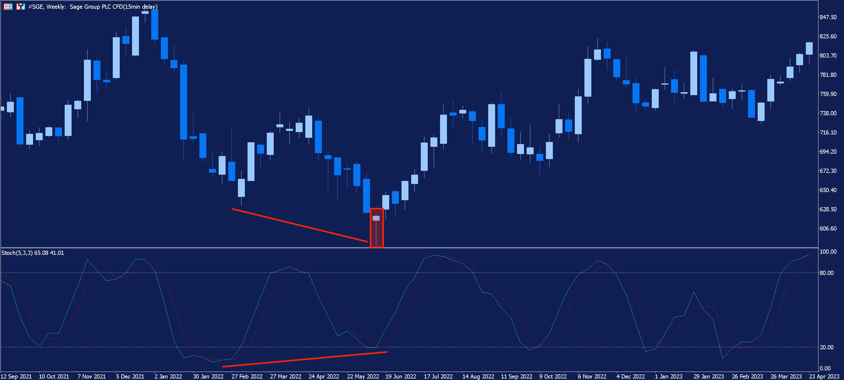
The hammer forms the bottom of the downward movement; however, we can see that, while the price is still falling, the Stochastic Oscillator starts moving in the opposite direction. This is another example of divergence, which we spoke of earlier, and can serve as warning of a potential reversal in price.
A trader trading this pattern in real-time may have taken this bullish divergence as additional confirmation of a reversal and taken a position in the market.
However, more cautious traders might seek more confirmation, something which can be done using support and resistance levels or additional technical indicators such as the moving average.
For example, during an uptrend, bullish candlestick patterns which form around an area of support may carry more weight than those which do not.
Risk Management
Although the candlestick patterns examined in this article all indicate a potential bullish reversal in price, in reality, a reversal will not always materialise.
Even with additional confirmation, all these patterns will produce false signals from time to time. That’s why it is crucial for traders to exercise good risk management when trading the financial markets.
For example, traders should always set a stop-loss to help minimise their losses in the event of adverse market movements. Likewise, traders should never risk more than they can afford to lose on a single trade.
The given data provides additional information regarding all analysis, estimates, prognosis, forecasts, market reviews, weekly outlooks or other similar assessments or information (hereinafter “Analysis”) published on the websites of Admirals investment firms operating under the Admirals trademark (hereinafter “Admirals”) Before making any investment decisions please pay close attention to the following:
- This is a marketing communication. The content is published for informative purposes only and is in no way to be construed as investment advice or recommendation. It has not been prepared in accordance with legal requirements designed to promote the independence of investment research, and that it is not subject to any prohibition on dealing ahead of the dissemination of investment research.
- Any investment decision is made by each client alone whereas Admirals shall not be responsible for any loss or damage arising from any such decision, whether or not based on the content.
- With view to protecting the interests of our clients and the objectivity of the Analysis, Admirals has established relevant internal procedures for prevention and management of conflicts of interest.
- The Analysis is prepared by an analyst (hereinafter “Author”). The Author Roberto Rivero is a contractor for Admirals. This content is a marketing communication and does not constitute independent financial research.
- Whilst every reasonable effort is taken to ensure that all sources of the content are reliable and that all information is presented, as much as possible, in an understandable, timely, precise and complete manner, Admirals does not guarantee the accuracy or completeness of any information contained within the Analysis.
- Any kind of past or modelled performance of financial instruments indicated within the content should not be construed as an express or implied promise, guarantee or implication by Admirals for any future performance. The value of the financial instrument may both increase and decrease and the preservation of the asset value is not guaranteed.
- Leveraged products (including contracts for difference) are speculative in nature and may result in losses or profit. Before you start trading, please ensure that you fully understand the risks involved.